Next week I’ll be revealing the brand new paperback cover for I Let You Go, which is very different to the trade paperback version, yet still manages to completely reflect the story. Not having an artistic bone in my body, I’m fascinated by the process of book design. To find out more about it, I interviewed Toby Clarke, who has worked on covers and marketing material for most major publishing houses.
Tell me a bit about your company. What do you do, and who for?
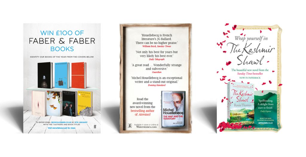
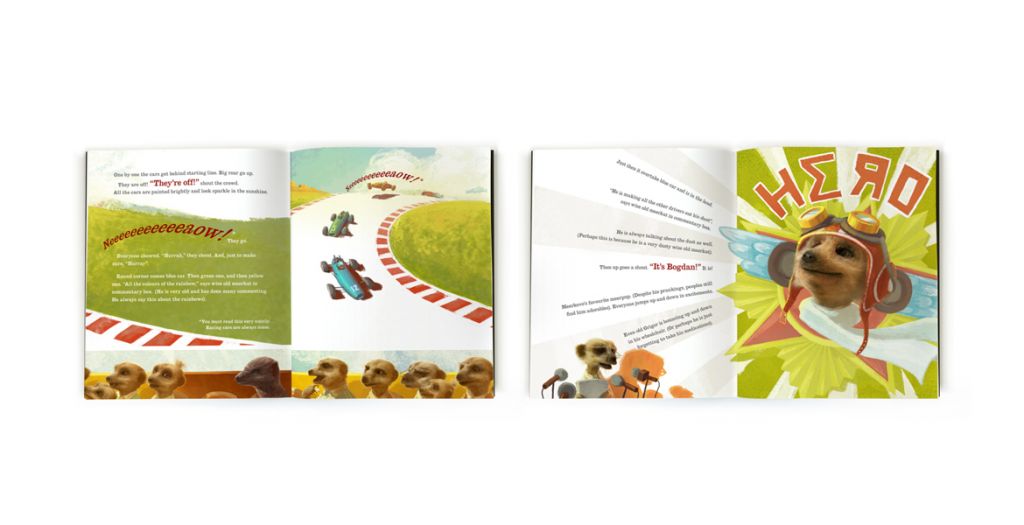
We’re a small graphic design company. We mainly work for the book industry designing book jackets, interiors and a whole host of marketing materials. It’s great working with all these creative minds in publishing on new ideas, and it keeps things fresh and exciting (and means we have to keep up-to-date with all the latest trends and software). We also work for the events industry designing the themes for seasonal events – Christmas, summer, weddings, Olympics, conferences – that sort of thing, plus we do a bit of packaging design, and interactive bits and pieces.
How did you get into this line of work – was it always something you wanted to do?
Not at all. I had no real focus, although my instinct was towards something with art or outdoors. My parents had always encouraged me in art. It was the only subject I was especially good at through school and I studied it at university. I had dozens of run-of-the-mill jobs through my teens (in shops, factories, restaurants, pubs, hiring out boats and a care home) and then I moved to London to work in the conference industry (well, truthfully, the film industry first but I didn’t like what I saw). I wasn’t very good at conference marketing. I just wasn’t stimulated enough and it showed. (I did make some good friends though, one of whom is now a great client.) Eventually, I rang a small typesetting company I had employed there and offered to come and work for them for free. I think they were somewhat surprised, but amazingly they agreed. I went from there to a design company that specialised in publishing and then to Virgin Books, which became part of Ebury Publishing at Random House – then finally I set up on my own. What I like about publishing, without meaning to sound sycophantic (and it will), is that everyone is unfailingly nice. I’ve not met anyone I didn’t get along with.
In relation to book covers, what information do you get from the client before starting work on the cover? What’s the first thing you do when you start work on it?
It depends on the genre, but the brief is generally no more than a side of A4 with a brief synopsis of the content, some guidelines as to what the editorial team is looking for and some examples of other books in the area that they like (or definitely don’t like so I know what to stay away from). The fiction briefs tend to be more specific. Sometimes the editor will call me to have a chat, which is always good, but I like to have the brief, absorb it and do a little research if I can before we have that conversation. It’s not always possible though as I do get a number of briefs that are on a very tight deadline and first drafts have to be done within days. I quite like that challenge if I’m able to fit it in.
If I have time, the first thing I do is read and re-read the brief. I’ll start to make a list of keywords, thoughts, themes over a couple of days while working on other projects. I’ll then sketch out some quick ideas and put those to one side. The next stage is spending a good amount of time researching. That means looking at other jackets, (there are some amazing covers out there), image ideas and key phrases. I’ll often type in a key phrase or word relating to the theme into Google and just see what comes up. It usually won’t give you an idea directly but can take your thinking in a new direction. At each stage I’ll be making a few notes.
Next, I’ll roughly sketch out 5-10 different approaches on the layout and style of the text. I usually start with the typographical look as it’s the most important element of most jackets – particularly in this digital age when all readers see is a thumbnail.
Usually ideas come to mind straightaway but often you find that when you put them down on paper they don’t work. I’ll spend a few hours putting together things on my mac, then set it aside for a day or two and revisit. I’ll do that two or three times over the course of a week to ten days, as often you come back to it and change your mind. I also have to print them out, lay them out on the floor and look at them like that before I can decide which I like. Somehow just seeing it on screen doesn’t do the job.
 Do you read the books you design covers for? If so, at what stage?
Occasionally. But usually after the cover is done, and the book is out – I might get sent a copy (although I read a great deal on e-readers nowadays). In an ideal world I’d love to read every book prior to designing the cover, but it’s just not practical as I can be working on 10 different projects at the same time. And often the book hasn’t been written at the point when the cover is designed.
How many times does the cover go back and forth between you and the client?
That varies between publisher, type of book, the timeframe and who’s involved. There’s often a fair bit of tweaking of small details once the general cover look is achieved and the booksellers get involved. The most important thing is to get a book cover that not only does the content justice but that sells. I always start out with a desire to make something beautiful but I am definitely aware of commercial needs.
Do you ever get feedback from the author themselves?
Yes, sometimes. I either get feedback through the editor or get an email direct from the author, which is always nice. The only time we meet tends to be if there is a photoshoot (for an autobiography, for example) and I’m asked to go along. So far they have all been amazingly nice. There was one author who ran a course (Tristan Gooley, The Natural Navigator) which sounded great so I went down to Sussex and spent the day learning how to navigate in the wild, without recourse to compass, etc.
What is the cover you’re most proud of?
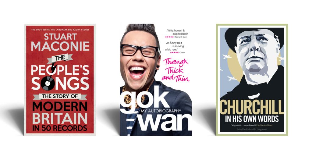
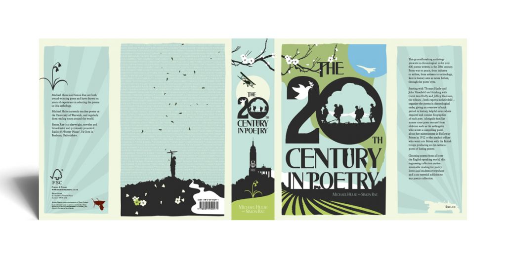
That’s impossible to say as it changes all the time – it also depends on what we went through to get there. Sometimes it’s about whether I’ve ‘got’ what the editorial team want and maybe gone beyond that, rather than it being an award-winning design. You know if a cover is good or not at the finish and whether it’s met the brief. It’s great to hear good feedback on jackets, though, and people often come back to the illustration I did for The 20th Century in Poetry, so let’s say that one.
How often do you have to completely scrap a design and go back to the drawing board? How does that feel?
Thankfully not too often. Generally I’ll supply 4 or 5 rough cover approaches to start with anyway, and we’ll narrow it down that way stage by stage. I try to give options based on the brief and, then, if I think there might be a better way, I’ll do that as well. I do think you know when you send them in if a cover is any good or not, and each time I do a set, there will be one which clearly stands out for me, but I’ll include the others to give the publisher options. I’d say the one I like gets progressed about 50% of the time.
Do you have a favourite genre to design for?
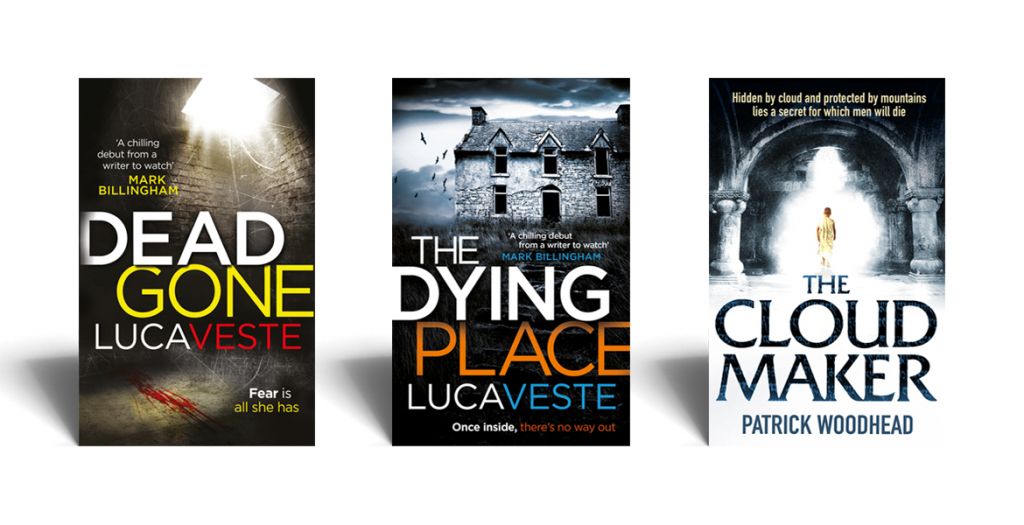
Not especially, although I do like the darker fiction projects. I tend to see things in a filmic way (Edward Hooper was my painting influence when at university) and that genre lends itself very well to that. I also do a lot of non-fiction which is great – particularly nice when you have the opportunity to bring in a little twist or humour – something small. I try to do it reasonably frequently (you know when you can and can’t) but it often doesn’t get past the editorial meetings!
Apart from book covers, what other work do you do for the book trade?
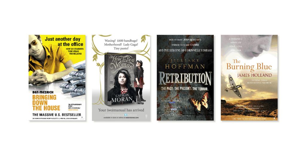
Anything and everything! I do a fair amount of interiors – plus all the marketing materials you could imagine. That’s changed hugely in the last year, moving very much over to digital and social media. I’m doing many more takeover skins for websites, animated ads, web pages and Twitter/Facebook cards, and much less of the traditional brochures/posters/ads. I’m constantly reviewing what I can do and making sure I keep as up to dates as I can while still working.
Do you work on a computer, or do you sketch by hand?
My work is mainly about very commercial design. I mostly use the mac, although I hand draw type occasionally, and work with sketches. Aside from my mac, my most used piece of equipment is my full-frame digital camera. If I’m working on a poster for example, I might set up a book (any book as long as it’s the same format) in a particular situation in my kitchen, shoot it and then work with that in photoshop. It’s lovely to do things in a more hands-on way (such as letterpress) and it gives it a more unique and interesting feel, so I’m always looking for ways to do things differently and make people engage with the designs.
In between running and raising a family, Toby has worked in publishing for the last 16 years, including a 4 year spell at Random House as head of the art department for Virgin Books and latterly Ebury Publishing. He founded ClarkevanMeurs Design in 2011.
